The Stories Behind the Visual Identity
Every element of the Little Tokens Big Ripples visual identity carries intention. Here are the stories behind what you see.
THE PRIMARY LOGO
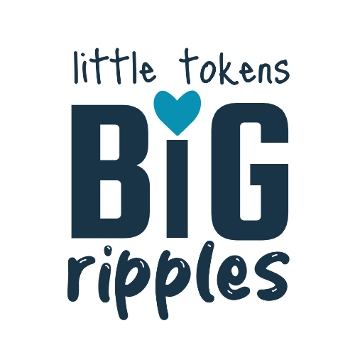
A Typography Tale
The typography itself demonstrates the core message: small gestures create big impact. Instead of uniform text treatment, I used size contrast to tell the story visually. The handwritten elements aren’t just stylistic—in a world obsessed with digital perfection, choosing slightly imperfect typography is my way of owning human creativity.
The teal heart positioned in the center of “BIG” shows what transforms small tokens into big ripples: love and connection. It’s not decorative—it’s the most important part.
The heart demanded center stage because this practice isn’t really about tokens or techniques—it’s about the love, grace and kindness we give to ourselves first before it ripples outwards.
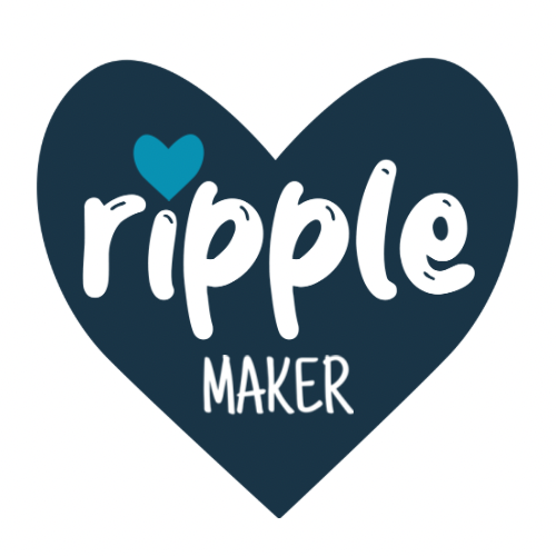
THE COMMUNITY BADGE
Intentional Unbranding
The Ripple Maker Community Badge intentionally contains no URL, no calls-to-action, no promotional elements. This badge is about pure belonging.
When you put this on your laptop, water bottle, or journals it’s not promoting my business. It’s declaring an identity: “I’m someone who believes small acts of love create big change.”
The clean design serves connection over conversion. This is what it means to be part of a movement, not a marketing campaign. Stickers coming, soon!
THE COLOR PALETTE
Teal as Inclusion
And if you’re wondering why teal became my color—it started with a pumpkin.
My daughter was 18 months old, and already navigating a long list of allergies. We painted a pumpkin teal for Halloween, as part of the Teal Pumpkin Project—offering non-food treats so that kids with allergies could participate, feel safe, and feel seen.
That pumpkin sat on our porch as a quiet invitation: This is a safe house. You belong here.
Years before I had a brand, I had that teal pumpkin.
Years before “ripple making,” there was just a mama with a brush and a baby with allergies, trying to make joy more inclusive.
That’s why teal stuck.
Because for me, it’s always meant care, and space, and deep noticing.
THE RIPPLE GLYPH
An Iconic Emblem
Three flowing forms:
A ripple received (deep teal) – the kindness that touches you deeply
One made (light seafoam) – your vulnerable, creative response
One passed on (deep navy) – the impact flowing forward, boldly
The act of making—that moment of quiet, creative courage where you move from receiving to giving—is the most tender. That’s why the center ripple is the softest color. It honors the pause, the permission, the risk.
This is what it means to be a Ripple Maker.
Not to perform. Not to perfect.
But to let your presence become a gift.
This isn't just the story of how a logo came to be. It's the story of how visual design can become a vessel for values, how creative choices can model creative courage, and how the most meaningful brands emerge not from strategy sessions but from the authentic practice of what they claim to represent.
Little tokens, indeed, creating big ripples—starting with a logo that dares to look like love.


